

Aviation


Antonia Harding & Carrie McEwan


Antonia Harding
Senior Exterior Livery Designer


Carrie McEwan
Principal Human Factors Specialist
A vehicle’s livery — design jargon for “paint scheme” — may seem inconsequential to some, but when it's applied to a fleet of over a thousand vehicles across a large urban area, the littlest choices can have dramatic effects on a system’s ease-of-use, carbon emissions, and safety. This is why, even when it comes to a paint scheme, Teague centers the user experience in our design process.
Teague is home to some of the most experienced livery designers in the world, having collaborated with Boeing for 77 years and produced award-winning work including the new livery for Air Tahiti Nui, the iconic Salmon Thirty Salmon and Orca liveries for Alaska Airlines, and "Disney Magic" for WestJet. In addition to our work on planes, our team has been involved in livery design for cars, trucks, buses, aircraft, and even spacecraft.
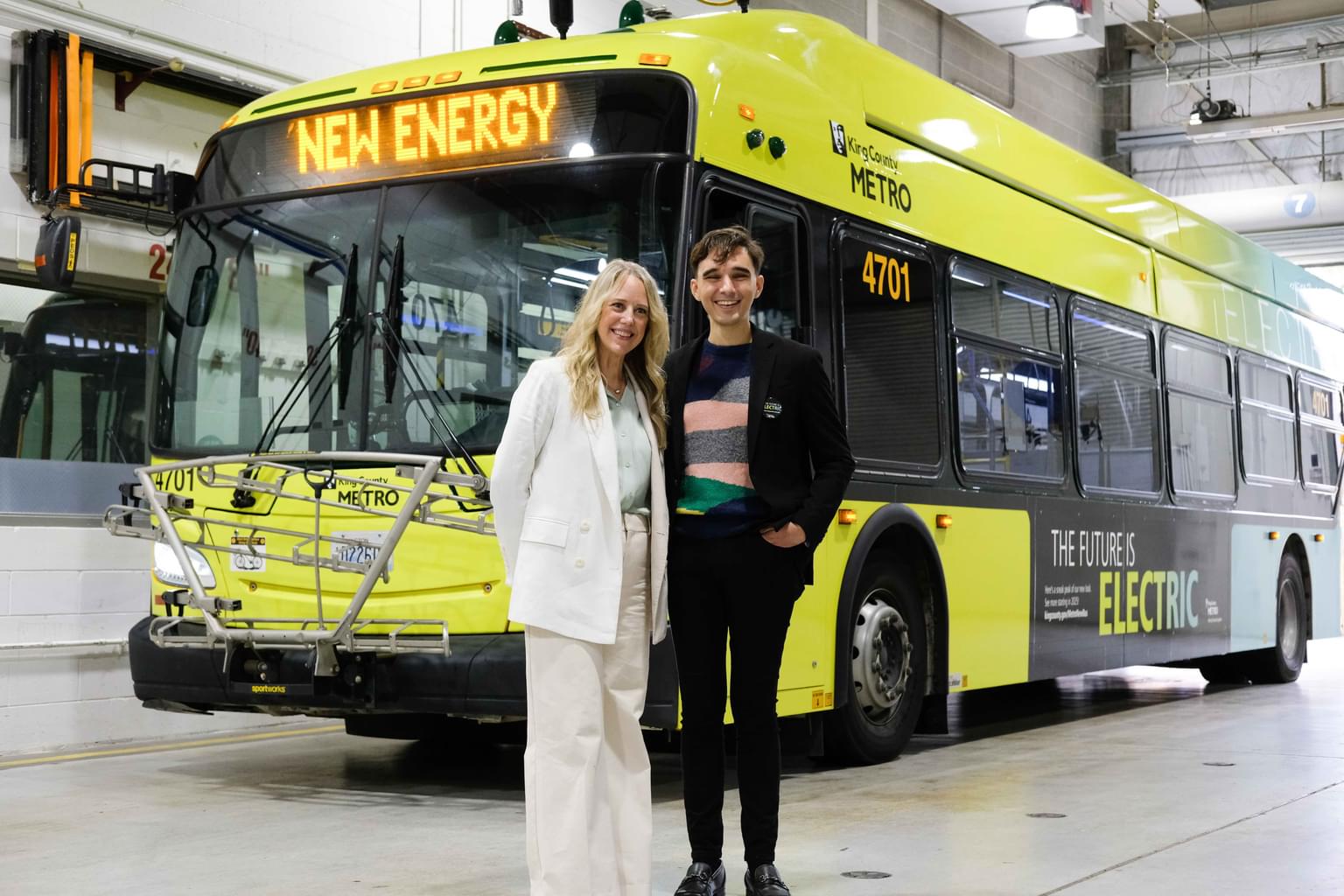
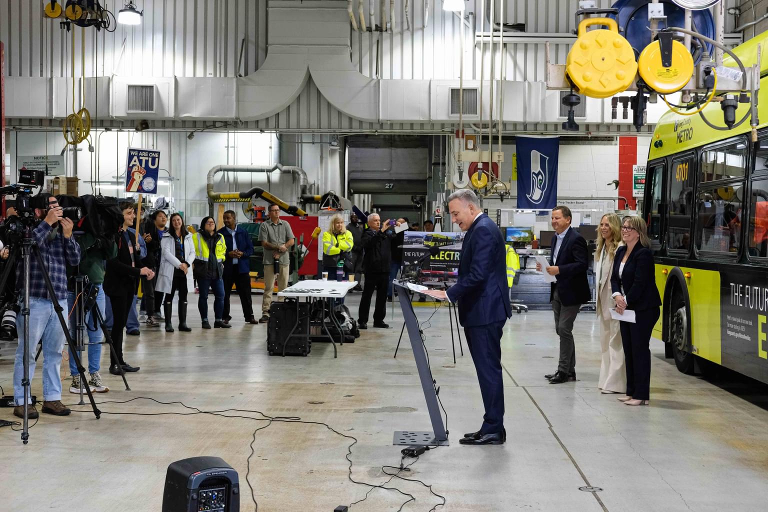
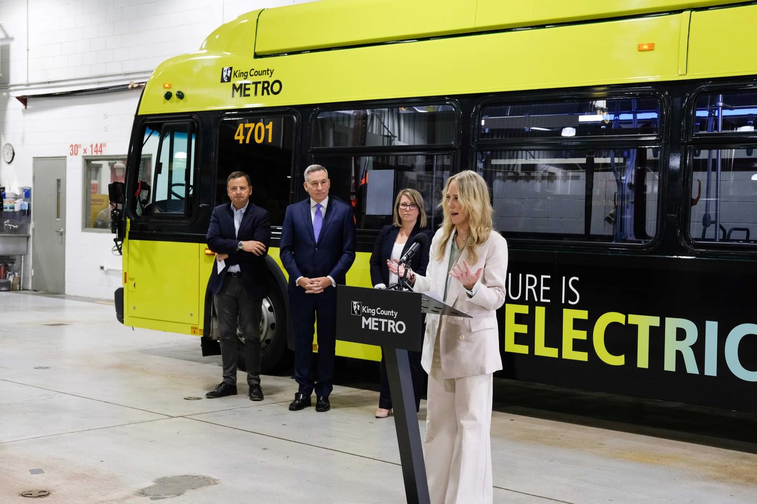
Recently, we partnered with King County Metro, one of the largest transit systems in the United States, to create a new livery design for their local and regional bus service and their bus rapid transit service called RapidRide. These new designs, celebrating their admirable transition to an all-electric fleet, will breathe new energy into the streets of King County and the greater Seattle area.


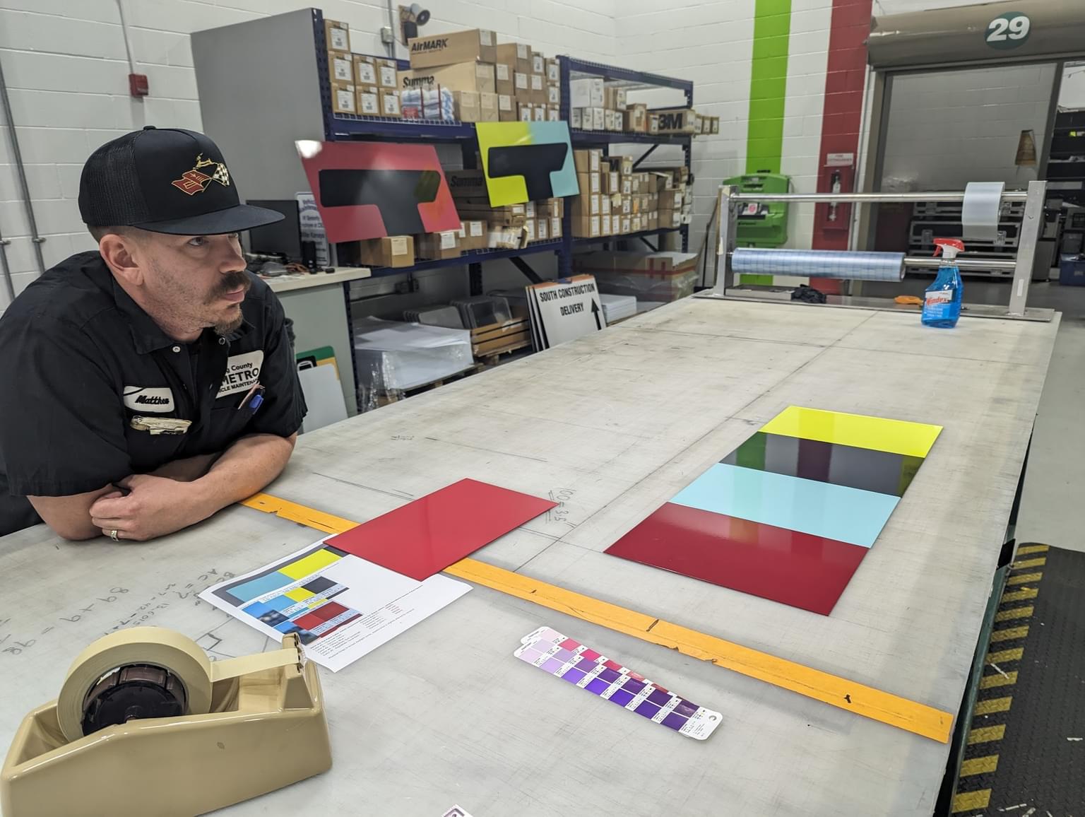
No two livery projects are ever the same. Vehicles come in all shapes and sizes, and painting liveries can be complex. That’s why our approach begins with research: we gathered insights from stakeholders across King County Metro and its community partners, which were then used to define design drivers, trend studies, and user experience criteria.
Rider feedback indicated that a new livery should have a purpose and support riders’ understanding of the transit system, with clear, visible indication of the route and key.
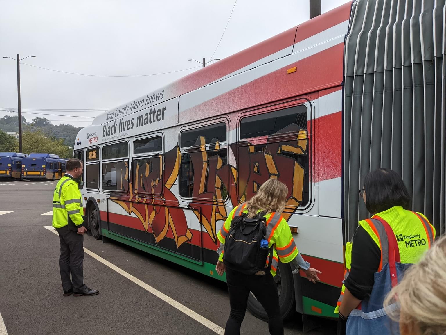
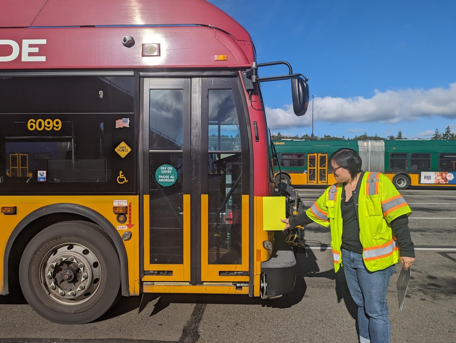
We found that King County Metro’s previous livery design system was complicated and inconsistent. Buses and trolleys were variously dark green, light green, blue, purple, and red without clear reasoning. Stripes appeared in different shapes, angles, and were not consistently applied from model to model, owing to the idiosyncrasies of different vehicle shapes which created installation challenges for the paint team. Despite 20 years of implementation, the existing design did not have an agreed-upon “iconic image” in the mind of King County Metro users.
Not having a consistent image has a direct effect on a system’s ease-of-use. Think of all the bits of information a user must keep track of on their daily commute: "What's that sign say? What’s my route number? Is that my bus?” Rider feedback indicated that a new livery should have a purpose and support riders’ understanding of the transit system, with clear, visible indication of the route and key.

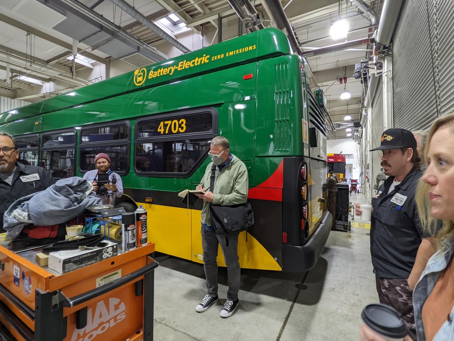


We also heard from King County Metro employees a strong sense of pride in their “office” on the bus and their desire to celebrate the new all-electric fleet. For years, King County Metro has “walked the walk” in its sustainability goals by being an early adopter of battery-electric buses and electric trolleys. Yet the existing livery design did not clearly highlight these achievements. Internal stakeholders made clear to us the desire to brighten the mood, celebrate its positive future, and make the transition to a zero-emissions fleet unmissable.
The King County Metro team had an internal goal to stand out from other transit groups in the area, but also reflect the culture and values of King County. We wanted to avoid overused “green” design motifs, such as leaves, electric plugs, and swooshes which add unnecessary complexity and no longer resonate with consumers due to their association with greenwashing. Instead, the new design communicates new energy with striking use of color and eschews complex art in favor of a clean, simple approach that reduces the number of colors, and therefore, paint waste. Brighter colors will also reflect heat, which helps extend battery life and potentially improves range-per-charge.
Interviews with the King County Metro Equity Cabinet also revealed the need for the new design to increase accessibility, because the system serves residents and visitors who come from different backgrounds and speak hundreds of different languages. We solved for this by decluttering design elements, reducing verbose English language markings, and emphasized a clear, iconic appearance to keep the design easy to remember.


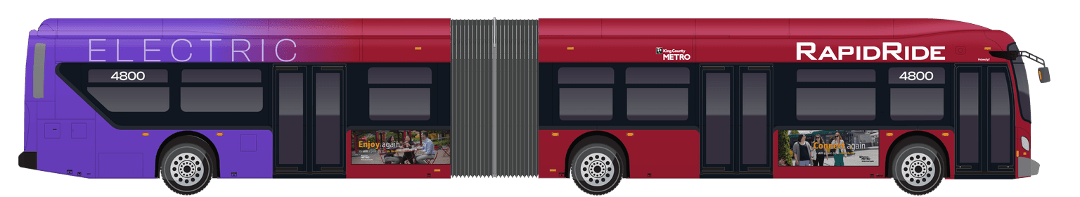
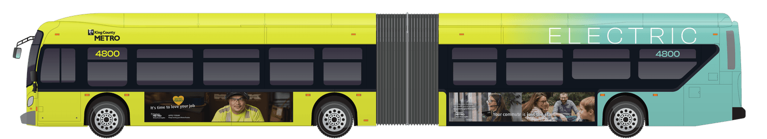
Centering the user-experience led us to a single design layout rendered in two colors: New Energy Yellow for neighborhood service, and RapidRide Red for bus rapid transit service. Each color has a clear purpose, and the livery becomes iconic by staying consistent with these expectations.
New Energy Yellow is a sharp color that can cut through the blues, greens, and grays of our region, maximizing the vehicle’s ability to stand out in all environments, all weather conditions, even when seen from a distance. The RapidRide design is simplified to fully capitalize on its pre-existing luscious red. This continued use of yellow and red, King County Metro’s historical colors, honors the legacy of people and communities who gave our region its thriving transit bus network. And while honoring the past, the future is embraced: because only the news buses will feature these colors, seeing these designs populate our streetscapes will be clear visual evidence of King County Metro’s transition to a renewable energy future.
In both versions of the livery, brightness is emphasized due to King County Metro’s commitment to safety for both bus riders and non-riders. We wanted to make sure drivers, cyclists, and pedestrians would be able to easily see the bus, so we integrated reflective safety stripes in the window silhouette.


The final livery design was informed by asking the right questions of stakeholders. From this foundation, we can explore all possibilities and find a solution that is truly centered on improving the user experience, which in the case of King County Metro, involves everyone who occupies the streets of our region. In our exploration, we created dozens and dozens of potential design schemes, but what we discovered in our partnership was the affirmation of a long-held design principle: Less is more.


