Mobility
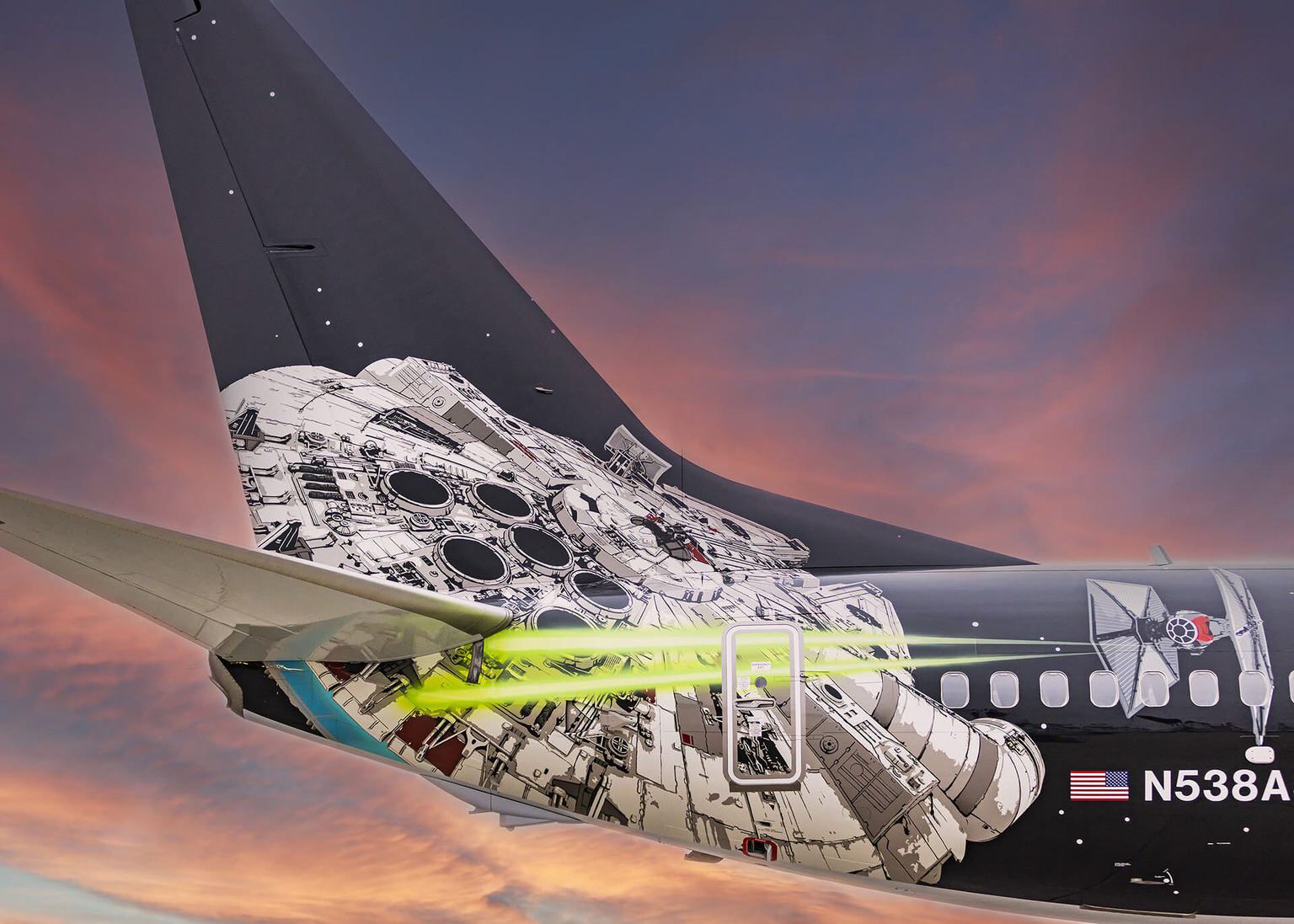
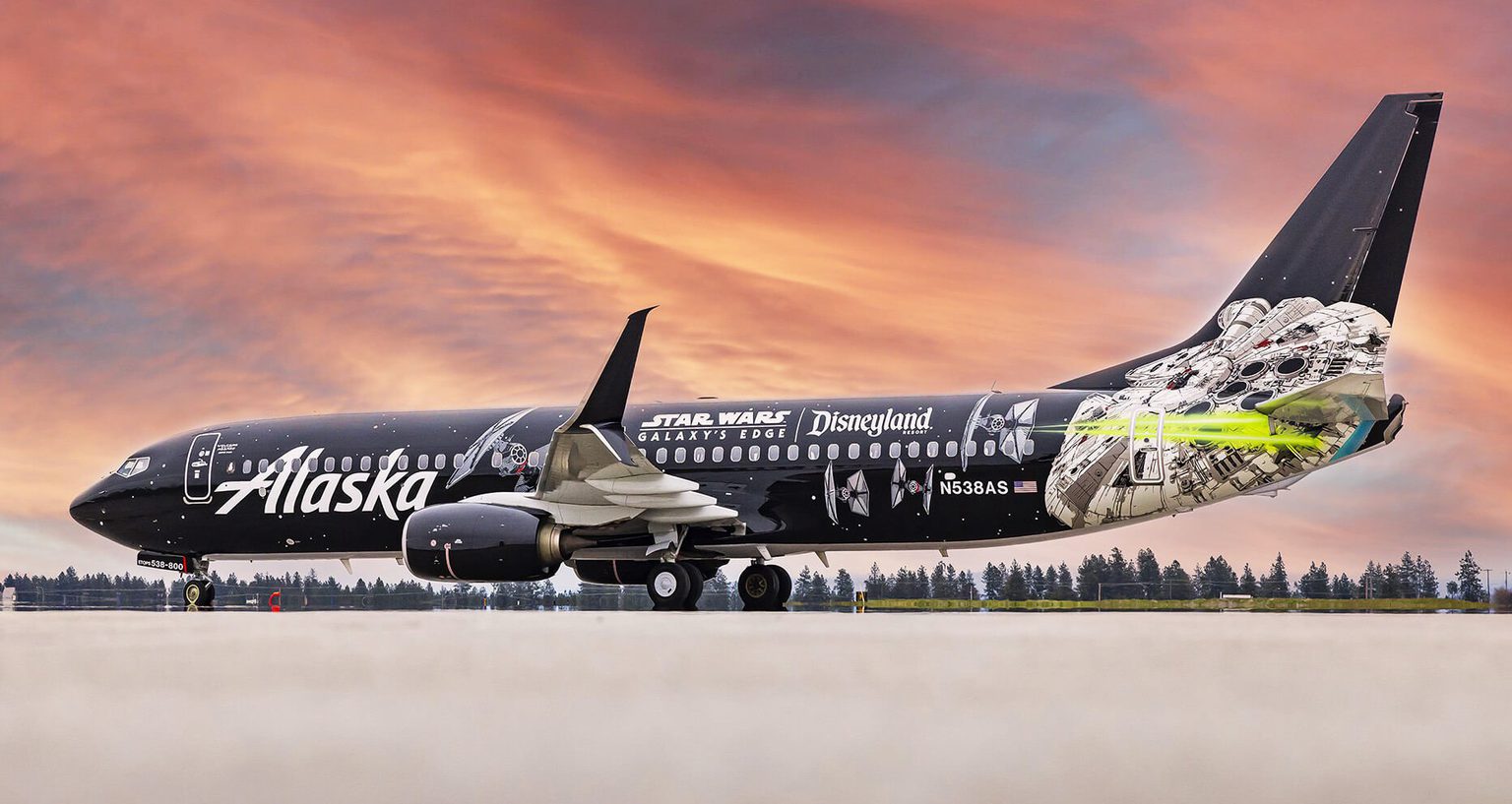
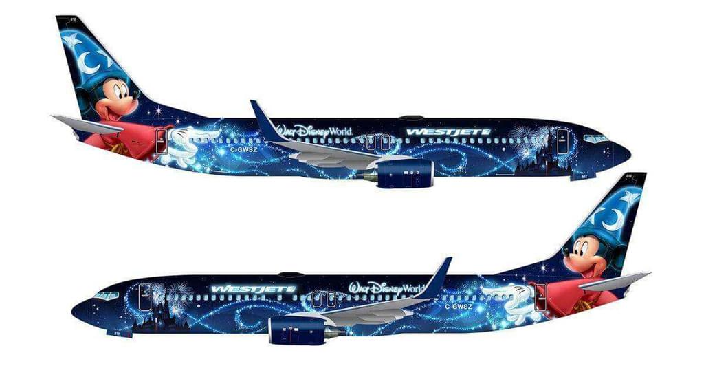
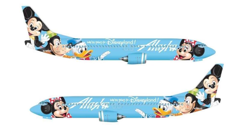
Aircraft livery design is a specialty at Teague, where Mark Boyle has been designing for more than 30 years. In addition to being an award-winning fine artist painting the natural beauty of the Pacific Northwest, Mark has led the design of now-iconic liveries, including the "Salmon-Thirty-Salmon" and "Hawaiian Lei" liveries for Alaska Airlines, "Disney Magic" for WestJet, and the "Pickachu Jet" for Skymark, among many others. Most recently, Mark worked on Alaska Airline's "Star Wars Transport to the Disneyland Resort" livery, which made its inaugural flight on May 4, 2022.
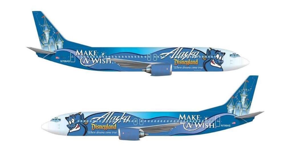
It's not easy to execute frost from Disney's Frozen, Jessie's flowing hair from Toy Story, or Tinker Bell's fairy dust onto the exterior of an airplane. I talked to Mark about how he and his team deliver these bold and iconic designs, and why special liveries are such a powerful tool for airline brands.
Let's start at the very beginning. Mark, how did you get into design?
Mark Boyle: I've been an artist since I was 11. I studied from master painters to glean as much information as I could about classical painting techniques and color theory, and over time refined that skill.
I went to Burnley School of Art. Quite a few of my Teaguemates come from there. I started out doing t-shirt design and illustration. I also worked for a printer and did some product design. I started designing airplane liveries at Teague in 1991.
What was livery design like when you began working at Teague in the early 90s?
Back then, we used cut film and rubdown transfer logos that we had to apply to a printed scale illustration. Everything was done by hand and presented on a board to the client. Eventually, Macintosh computers hit the market, and we started using CATIA. We still do. It saves time, and the data is super accurate, so we know precisely how to position our designs.
Tell me a bit about your process for developing and designing special liveries today.
Each airplane livery is a different puzzle to solve. So, each time the approach is a bit different. I often work by myself or collaborate with other designers at Teague. Sometimes I work with an airline's team to help fine-tune a design, simplify an existing design or logo, and create production drawings.
Once we move into the painting process, we have to adjust the design based on fuselage features continuously. The design is hand-airbrushed, and we mask off certain areas. There are a lot of elements on the airplane we have to avoid, complex areas like the wing-body fairing. It takes an expert to recognize these areas and understand how to move graphics three-dimensionally around the fuselage. Teague is one of the few design firms that do this really well.
Special livery designs are great investments for airline brands, they get a lot of attention and there's value in each design being unique, like an art piece.
What are the key elements of a great livery design?
Simplicity, for number one—a simple, elegant design. Dramatic and easily identifiable from a distance—that could be a plane with a striking gradient blend across the fuselage or a plane with a white fuselage and a simplified, bold, and elegant airline logo. If the design is simple, it has more visual impact.
A great livery should also excite people—on the ground, in the air, and across the globe. If the design delights, those positive feelings find their way to the airline's brand and build loyalty.
Why is a special livery design so essential and powerful for an airline brand?
It brings public respect and admiration to the airline. A great livery design generates customer loyalty, a warm feeling, and a love for the brand.
For example, Alaska Airlines' "Hawaiian Lei" livery design brings great respect to the native people of Hawaii. The livery was supposed to be a three-month promotion when the airline first started flying to Hawaii, but it became so well-loved and identifiable that they used it for 15 years.
Special livery designs are great investments for airline brands, they get a lot of attention, and there's value in each design being unique, like an art piece. Some airlines have noticed and made special livery design a permanent part of their marketing plans.
How do you collaborate with marketing and brand teams to tell a story, capitalize on a cultural moment, and do it at scale?
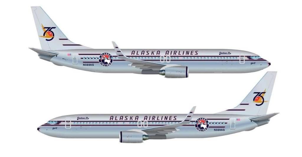
Collaboration takes on many forms and happens for a lot of different reasons. Anniversaries, global events like the World Cup and the Olympics, or special corporate initiatives and partnerships—there are a lot of great opportunities airlines can capitalize on.
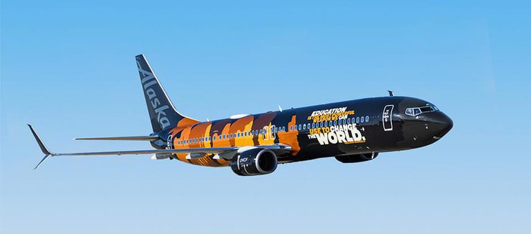
Last year, Teague had an amazing opportunity to help Alaska Airlines and UNCF execute a special livery design for the "Our Commitment" aircraft. The livery features beautiful profile illustrations of Alaska's next generation of leaders and was designed with Alaska's Air Group Black Employees, Allies, and Advocates (ABEA). It's a stunning livery and a powerful symbol of the airline's brand promise to create a place where everyone sees themselves and belongs.
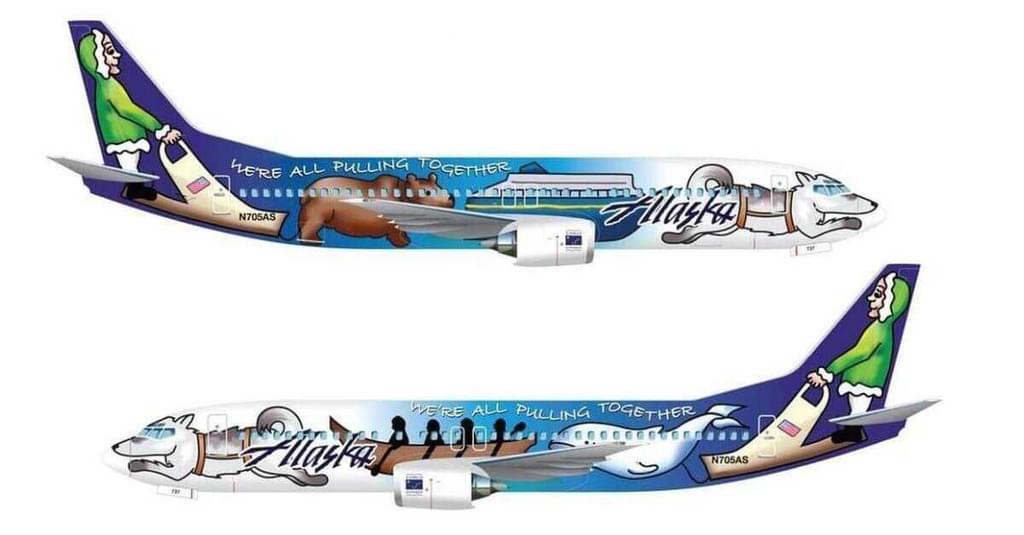
Several years back, Alaska Airlines wanted to pay tribute to the state of Alaska's 50th anniversary, so they invited kids from across the state to help design a special livery. The airline flew me up to Alaska to join a jury panel that included the former state governor and a winner of the Iditarod, along with other leading Alaskan figures, to select the winning design. We chose a design by Hannah Hamburg from Sitka High School; she created an exciting scheme of a dog sled across the fuselage. There was a dog on the cockpit window and a whale and a kayaker—she had different characters—the musher (driver) was on the tail. Bringing her design to life in the real world was a lot of fun.
I also did a promotion for the Portland Timbers. The Timbers asked the public for their input on a design, and it became a contest. They chose two winners and asked me to combine the two different designs into one simplified design. It was a beautiful airplane that flew for quite a while.
Prototyping, and making a designer's thinking actionable, is such an important part of the design process. How do you make those touchpoints tangible for clients?
Our approach is collaborative, hands-on, and iterative, always. We typically start with mood boards as a study for where the client wants to go. A lot of times those boards center on cultural elements or geographic regions unique to the airline or its routes.
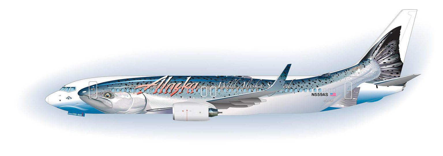
For Alaska's salmon livery, I collaborated with a marketing director who was interested in doing a seafood promotion that featured an Alaskan King Crab. A crab at that scale, with its spiny legs draped around the fuselage...that was something we needed to see before investing much time in the design. So, we created a simple mockup using a photo of a King Crab. Everyone agreed it was terrifying! We quickly moved on to the salmon livery design, and it was very successful. It's one of my favorites.
It's a point of pride to design a livery that authentically captures the spirit of a particular time or place to help an airline reach its business goals.
Yes, the Salmon-Thirty-Salmon! Why is that a favorite?
My skills as an artist came full circle in that design. It was a good excuse to get outdoors and go fishing in this case, which I love, and catch a King Salmon to make sure my illustration was accurate. It's a point of pride to design a livery that authentically captures the spirit of a particular time or place to help an airline reach its business goals.
The illustration is so detailed. It's more detailed than you normally see in livery design.
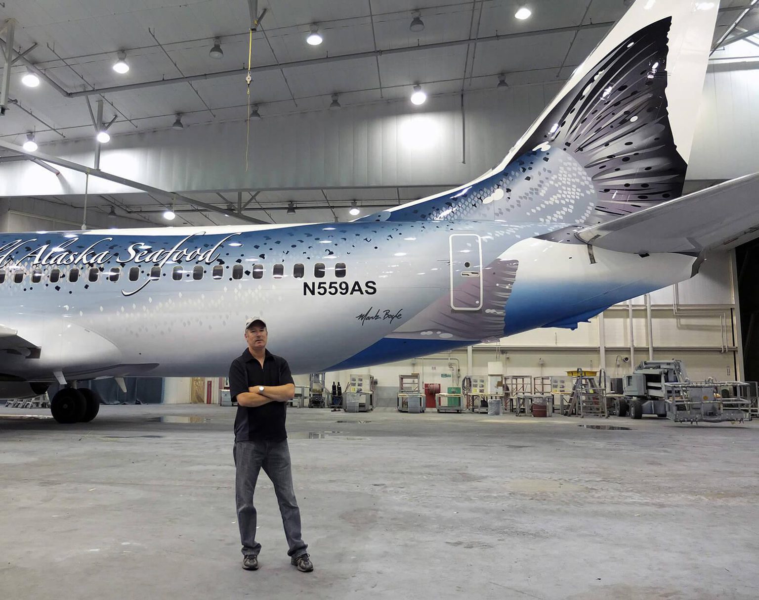
It is. Executing a design like that is only possible with an incredible team—it took a lot of great painters to pull off that design. There's a whole structure at the paint hangar, and I've had long-term working relationships with many of the painters, some for 15 years.
When I look at your fine art, it's so different from creating a livery. I'm curious about how you straddle those two different objectives and worlds, one personal and one commercial.
I see the world from an artistic viewpoint that carries over into my design work. Obviously, fine art, oil painting, is different; but it's related through color, pattern, and texture. Real-world experience, like going out into nature, and fishing for salmon, is what leads to the best outcomes across all of my work.
You oversee every specialty paint job at Teague personally. What keeps things fresh for you?
I love the variety of projects. Every project I work on is one-of-a-kind. It's impossible to get bored!
For a client recently, we had to come up with a simplified tail design to bring down the cost of production. One minute, I'll be doing something like that, and the next minute, I'll be drawing detailed flower petals for the "Hawaiian Lei." Every day is different.
Once in a while I hear from a friend, or a friend of a friend, who saw an airplane landing with one of my liveries and the whole gate of people go running over to see it; I feel honored that I'm given the opportunity to create something with that kind of impact and reach.
What is it about Teague and the people here that continue to inspire you?
There are a lot of really great people at Teague, and a lot of close-knit relationships across our design studios; I get to work with my friends. And I'm surrounded by an incredible range of expertise—product design, user experience, futurecasting, interiors, engineering, graphics, computer illustrators...I've been challenged and inspired for more than three decades working at Teague.
Is there anything else you'd like to share?
I've certainly been lucky and blessed to have a lifelong career as a designer.
Every airplane livery design I've worked on has been a success and the airlines saw great value in it. It's such a huge industry; there's a lot of untapped potential for creating and enhancing airline brand value through livery design.
If you're interested in learning more about livery design and how it can help you boost awareness, build loyalty, and communicate your brand values, we'd love to hear from you! Reach out to our team at hello@teague.com.
*This interview has been edited for length and clarity.