

Mobility


Virgin Hyperloop | Passenger Experience
Category
Expertise
As innovators race to create the next generation of energy-efficient mass transit vehicles, pioneering transportation technology company, Virgin Hyperloop, called on Teague to design its all-new supersonic passenger experience.
CHALLENGE
The first new mode of transportation since the introduction of the airplane in the early 1900s, Hyperloop promises to transform the transportation industry. Beyond the technical leaps required to deliver on that promise, one of Hyperloop's greatest challenges is building a product that people love and are also willing to trust.
Keeping a watchful eye on the future while laying the groundwork for emerging technologies, Virgin Hyperloop partnered with Teague to create an entirely new passenger experience rooted in trust, empathy, and human-centric design.


APPROACH
Hyperloop will be unlike any other form of transportation. Everything from the departure frequency and trip duration to the station experience, ticketing and boarding procedures, seating configurations, and mobility within the cabin is the sum of an entirely new experience.
Human beings naturally crave what's familiar. Anything that seems new or different triggers our fear of the unknown; this 'fight or flight' response has evolved over biology's history to protect humans against perceived threats. To build a bridge between the known and the unknown, Teague's pod design would embrace the "new" aspects of Hyperloop while orienting and comforting passengers with a sense of familiarity.
01/
02/
03/
04/
05/
06/
07/
08/
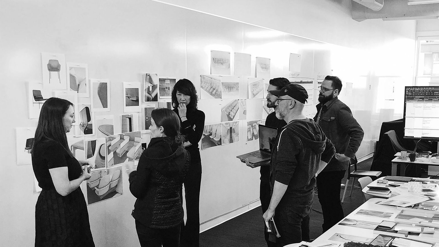
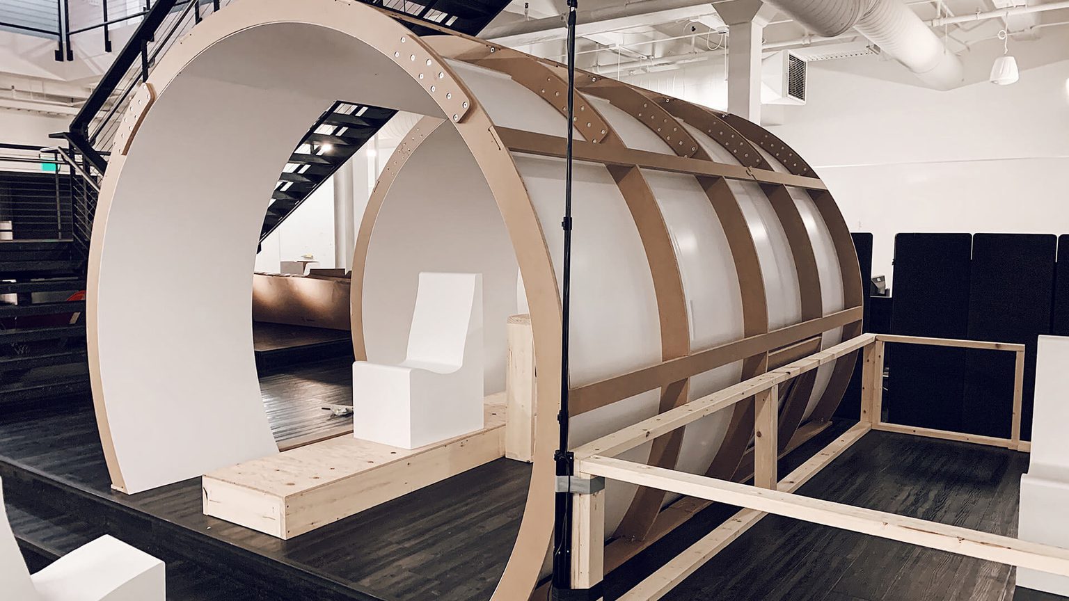
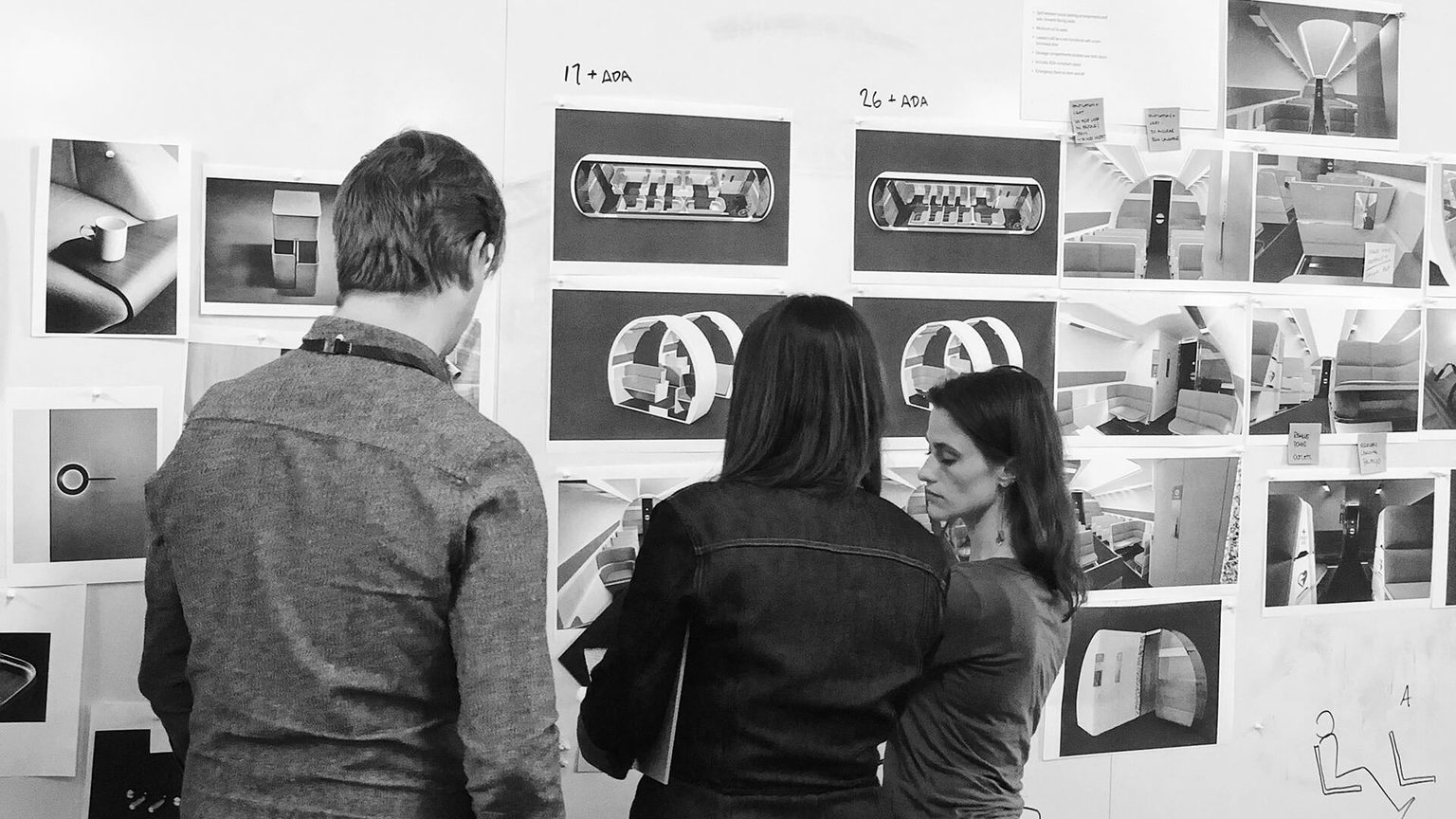
To kick off the project, our team created a full-scale volumetric model of the interior to use as a design exploration tool. The model allowed our teams to experiment with seat configurations and informed human factors and lighting design in a dynamic and real-time build. As part of our process, we also made extensive use of room-scale virtual reality (VR) to quickly evaluate design iterations. We commonly use VR tools and platforms to validate our initial concepts, including Garage, a tool we designed and developed that allows us to quickly review CAD models and their materials without a lot of 3D data pre-processing.


SOLUTION
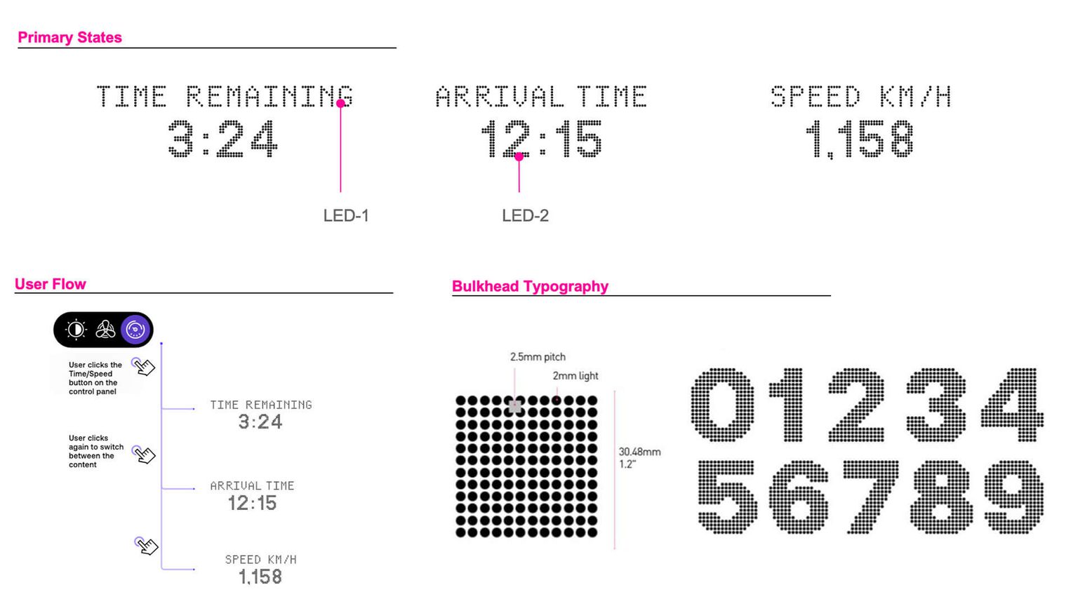
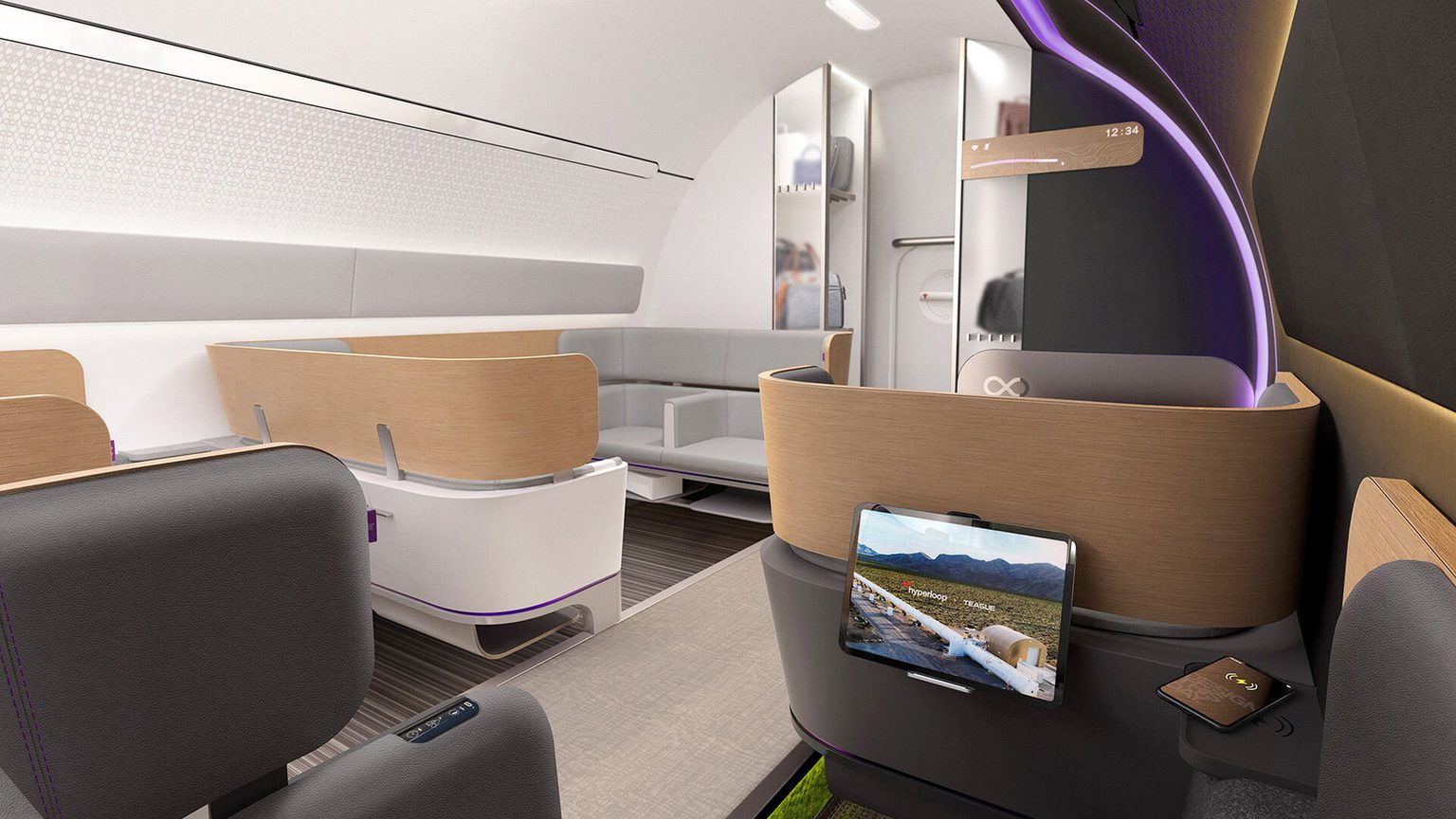
Imagine riding in an elevator at the speed of sound. One of the greatest design challenges with any Hyperloop pod is the total lack of windows. Other than elevators, most people have never experienced a moving windowless space. To solve for this, we implemented a dynamic ambient lighting system that visually opens up the space, simulates the time of day, and creates a subtle sense of forward motion. A large virtual "skylight" synchronizes with the outdoor ambient sunlight while hidden accent strips adjust the ambiance based on a trip's progress to help ease passengers through the journey.
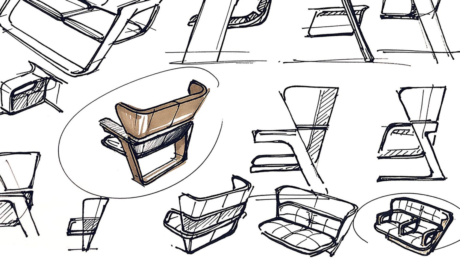
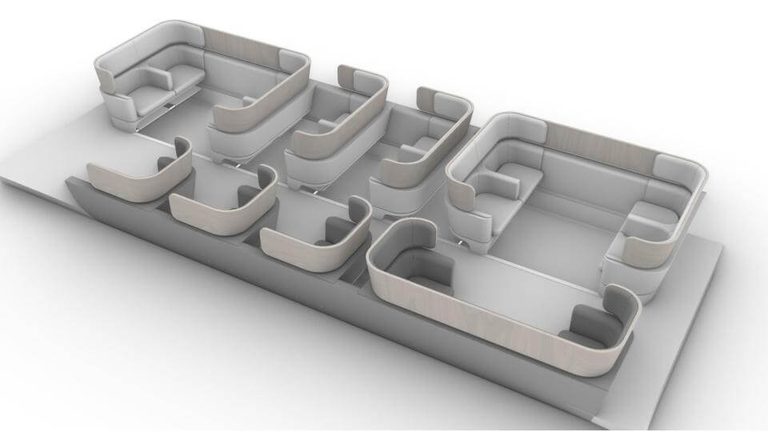
Another limiting factor: the interior diameter. To optimize the circular shape, we divided it into two zones: a movement zone—where passengers can freely move about the interior, and a static zone—where passengers relax in their seats and socialize or enjoy the journey. In the static zone, seats are recessed into the floor, straddling the mechanical and HVAC systems with a center aisle at ground level to alleviate any sense of claustrophobia. Stepping the seats down afforded us an additional seven inches of seated headroom. The step down also encourages passengers toward the pod's widest point should they need to move around more freely, while providing every passenger more shoulder room.


Far from a dystopian future where dark colors, stark lighting, and screens abound, Virgin Hyperloop’s counter-narrative is a more optimistic view of the future: a greener, smoother, safer, and more pleasant mass transit experience.
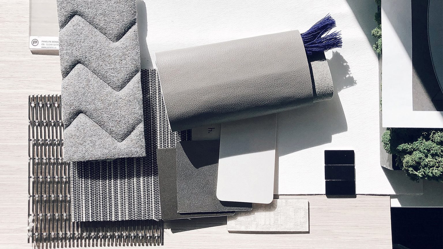
With this in mind, our goal for the interior design was to create a more human-centric environment centered on passenger well-being that emphasized brand quality and balanced the dichotomy between personal and communal space. A neutral palette of warm grays highlighting Virgin Hyperloop's brand identity paired with textures and a curated grouping of materials build a sense of depth and interest while allowing the interior's overall tone to provide a soothing backdrop for travel.
Our design centers on instilling trust and confidence to reassure and affirm passengers throughout their journey.
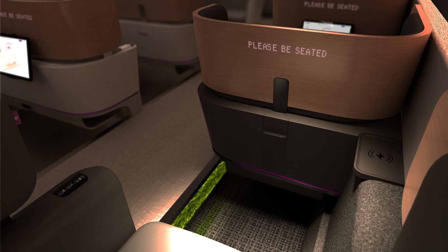
Beyond clearly marking emergency exits, which differ from boarding entryways, prominent placement of the intercom, flashlight, and fire extinguisher comfort passengers through whatever "what if" scenarios they might imagine. These comfort cues are complemented by interior finishes that are clean, warm, and supple with accents of wood, embroidery, and organic touches.
Hidden technology reveals itself only when needed to enhance the sense of discovery and delight. Metallics are treated as jewels, and known materials are used in unexpected ways, all with touches of brand expression. While purposefully subtle, the design details provide a calming aesthetic that complements the entire passenger experience.
In our design we wanted to establish a baseline for Hyperloop to be inclusive and avoid pitfalls other transportation types still struggle with. For example, our design makes it possible for passengers in wheelchairs to board and exit independently and have the same amenities as other passengers.


We combined familiar nods from other transportation types alongside unexpected touchpoints unique to Hyperloop to create a new experience that is both exciting and trustworthy
Clint Rule
Principal Director, Design | Teague
RESULT
Challenging convention is a brave endeavor. The resulting passenger experience is new and novel yet intuitive and just-around-the-corner.
Today, Teague continues to collaborate with Virgin Hyperloop on the passenger experience of the future, including evolving conversations around higher occupancy pods for different municipalities around the world.
Following their successful passenger testing in late 2020, Virgin Hyperloop is currently paving the way for the regulation and certification of Hyperloop systems around the world.


