Technology

In 2020, nearly two-thirds of US homebuyers made an offer on a property without an in-person viewing, a figure up 32% from the previous year. Pandemic-related circumstances have no doubt propelled the trend, led by millennials. Like everything else that’s been folded into the online shopping sphere, homebuying, too, will eventually become commonplace, albeit its widespread adoption can’t be accelerated with easy returns and democratization of reviews. Market players and technologies have to respond by translating the traditional process into a digital experience.
Like everything else that’s been folded into the online shopping sphere, homebuying, too, will eventually become commonplace; market players and technologies have to respond.
Teague delved into how to facilitate the transition, focusing on what could be achieved through smart design and existing technology now versus the future of fully developed AR and VR solutions. Stepping into the buyer’s shoes, we looked at available digital resources within the homebuying process: real estate listing platforms, FaceTime for remote tours, and media types. If a potential buyer has all the visuals, property info, and Google Street View at their fingertips, what makes seeing a place in-person so different?
We examined an all-too-common scenario: A listing’s hi-res, 360-photos piqued your interest. The dining room looks spacious with a big window--nice. The main bathroom looks great, too. But during an in-person tour, your dinner party visions are suddenly eclipsed by how odd it is that the bathroom entry is in the dining room. The photos didn’t exactly lie, and you had the floor plan, but... the mental map you stitched together via the content presentation wasn’t quite like this.
There might be other details missing from the online listing, as well, like too few electrical outlets or a major lack of light compared to what was clearly edited or staged in the photos, which might’ve been taken with a fisheye lens to make the space look bigger.
To transform rich media UX for virtual homebuying, we outlined this strategic framework:
1. Authenticity
Users need a truer sense of space in its totality, not a more expansive collection of content. A streamlined visual and digital experience should alleviate the brainwork of quilting together various images and narrow--if not eliminate--the gap between a mental map and reality
2. Consistency
Real estate agents are responsible for a listing’s media package, so even if the listing platform offers a consistent layout, the quality and type of content itself can vary. To standardize content, design talk should be less around the tools used to capture imagery and metadata, and more about modalities for presentation
3. Specs and Metadata
Part of this is an extension of authenticity: Aside from measurements and layout, what other critical decision-making factors, like light, street noise, and electrical configuration, impact one’s overall impression of a property? What can fit into a single UI?
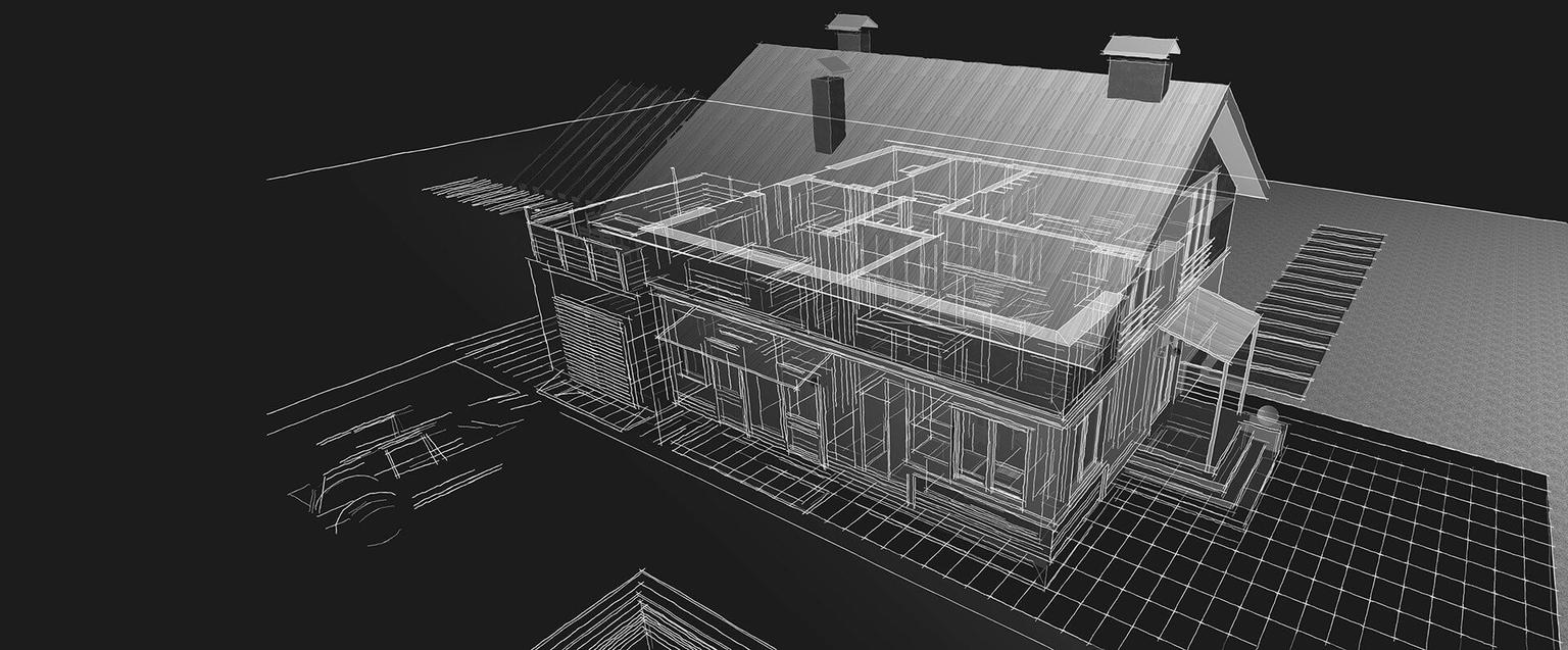
An optimized rich media experience would seamlessly encapsulate multiple aspects of property viewing, allowing users to traverse a space in its entirety with the ability to zoom in on points of interest and metadata. We conceptualized interaction models that leverage existing media types and tools, like traditional 2D photography, 360-video, and floor plans. We explored photogrammetry methodologies to extrapolate a 3D model from a series of photographs correlated with a vectorized floor plan. By developing their own tools, online real estate platforms could automate this and other processes, and procedurally create models of homes without onsite measurement.
For further contextualization, the team used Open Street Maps (OSM), an open-source online mapping service akin to Google Maps or Apple Maps that provides exportable lot, street, and structure data. This resource helps create a more enhanced 3D model and fosters the ability to demonstrate light and shade over the property throughout the day.
The real estate industry doesn’t have to wait for breakthrough VR or AR tools to up their digital game, and buyers shouldn’t have to either.
With rich media backfilled and standardized, the challenge becomes fitting everything but and the kitchen sink into a cohesive UI, particularly for mobile. Rather than a patchwork of various media types, our streamlined approach is to layer experiential aspects of a property tour within a ‘multi-tasking’ interaction model. A flexible, content-responsive lightbox is central to the UI, imparting a 3D viewport of the interior that corresponds with a small map indicating the location within the floor plan. Different click-through modalities bring secondary experiences to the forefront; for example, allowing the user to examine electrical configurations, click on a point of interest to zoom in on a faucet or countertop in hi-res 2D, and even listen to street noise or see a room’s lighting at a specific time of day. (We created tools that do both of those things.)
Here’s what our deep-dive into the homebuying arena ultimately showed: the real estate industry doesn’t have to wait for breakthrough VR or AR tools to up their digital game, and buyers shouldn’t have to either. Our UX and UI concepts used existing tools and media types--with smart design, technical chops, and a compelling vision. There’s no 100% substitute for an in-person property tour (until we’re challenged to virtualize a creaky floorboard or damp basement), but a virtualized experience can come close enough to impact the market.