Technology
Nick Ross & Kevin Clarridge

Nick Ross
Creative Director

Kevin Clarridge
Senior Industrial Designer
The pandemic got us to rethink a lot of things in our lives. Our priorities, our paths forward—our health. We had no choice but to adapt when our everyday routines were upended by COVID, yet as the shock of it all wanes, we’re questioning the value of old norms in the first place. Was it ever really ideal that our healthcare started and stopped in the doctor’s office?
Much like everyone else at the start of the pandemic, we began to notice that people wanted to better manage and take control of their own healthcare, as well as taking precautions to protect those around them. As designers, we were compelled by the challenges of patients and providers in a uniquely complex industry, and saw an opportunity to help.
Like urban exodus and permanent adoption of remote work, another cultural shift emerged from the pandemic: The percentage of patients open to telemedicine for routine care soared from 11% in 2019 to almost 80% in 2020. It signaled a readiness. One that would stick. And deciphering the temporary stuff from what would remain on the post-COVID page was critical to laying out the problem space. At the onset of our endeavor, the uproar in the medical field made it easy to be ensnared by short-sightedness, and we didn’t want to create makeshift solutions with a short shelf life.
Like urban exodus and permanent adoption of remote work, another cultural shift emerged from the pandemic: The percentage of patients open to telemedicine for routine care.
Still, uncertainty and fear remained firm in the equation. Infection risks were real (and still are; we’re not out of the woods yet), and hospitals were the eye of the storm. People were afraid to go. Many of us at Teague have loved ones who work in the medical field and relayed first-hand the turbulence and hazards of working on the frontlines. Plus, there was the domino effect of COVID inundation, which meant that patients of other conditions and concerns were deprioritized.
To tackle the core problem, we had to dig deep to determine what it was. Our research took us in a lot of different directions, first peeling back the layers of COVID chaos, then peeling back traditional protocols to ask key questions and find a red thread. What were the most common reasons for doctor's appointments? What was actually being done that required in-person interaction? How were time and resources spent for each visit? At what stages of a medical concern were people making (or missing) appointments? Here are some of the statistics that drove our design criteria:
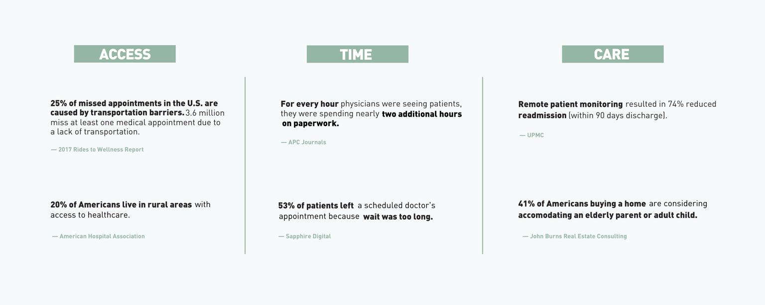
After mapping the landscape of insights and opportunities, we outlined a strategic framework that came down to saving time and resources, providing access to information, and promoting preventative healthcare.
For Patients
For Providers
And, of course, there’s always the money factor. Achieving all of the above is cost-saving from every angle.
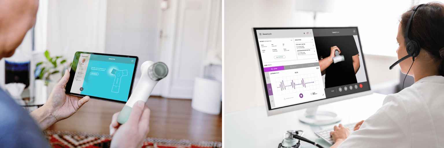
The “quantified self” trend was a nod to preventative healthcare, shown through the widespread adoption of wearable devices to monitor caloric intake, daily steps, sleep activity, and more. Although this trend seemed to have plateaued before the pandemic, it made for a good jumping off point in conceptualization. We’d encapsulate AI and key technologies in one intuitive design that would not only capture accurate data for users, but also allow it to be digitally shared with providers and stored in patient records.
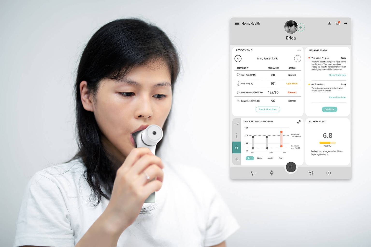
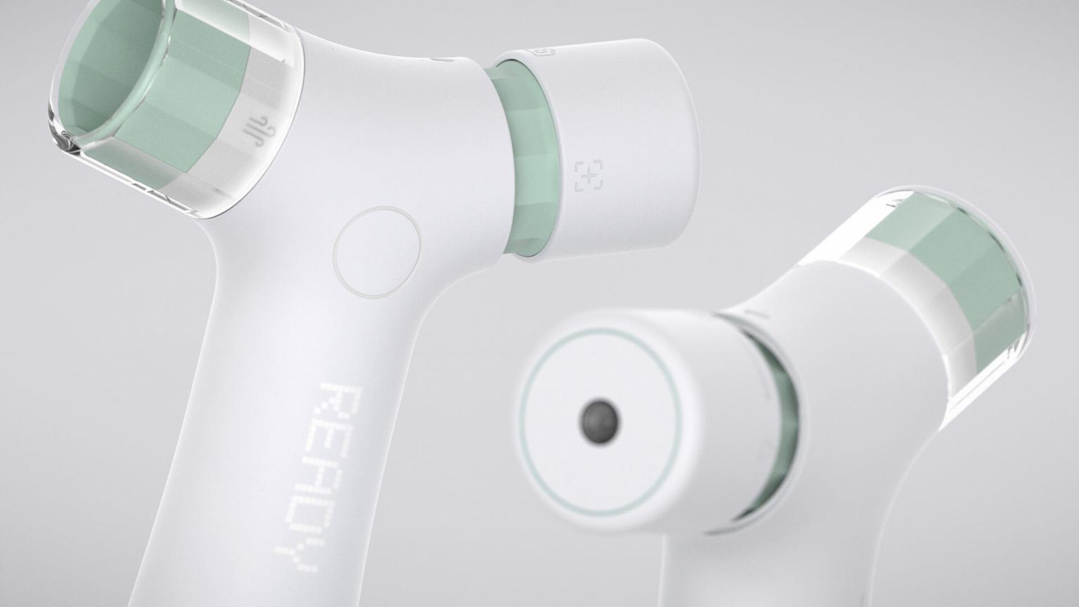
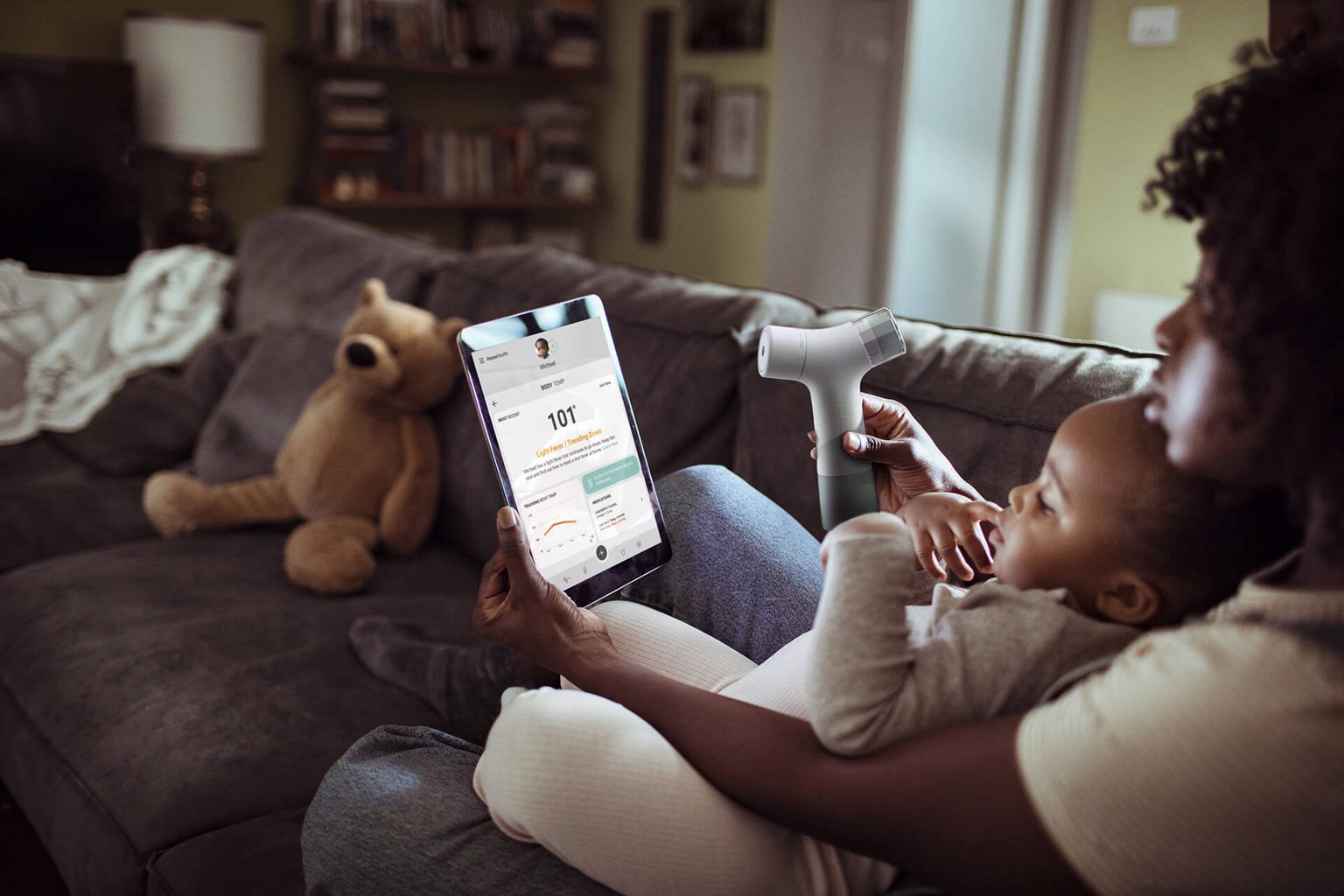
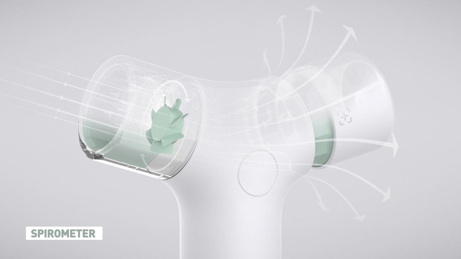
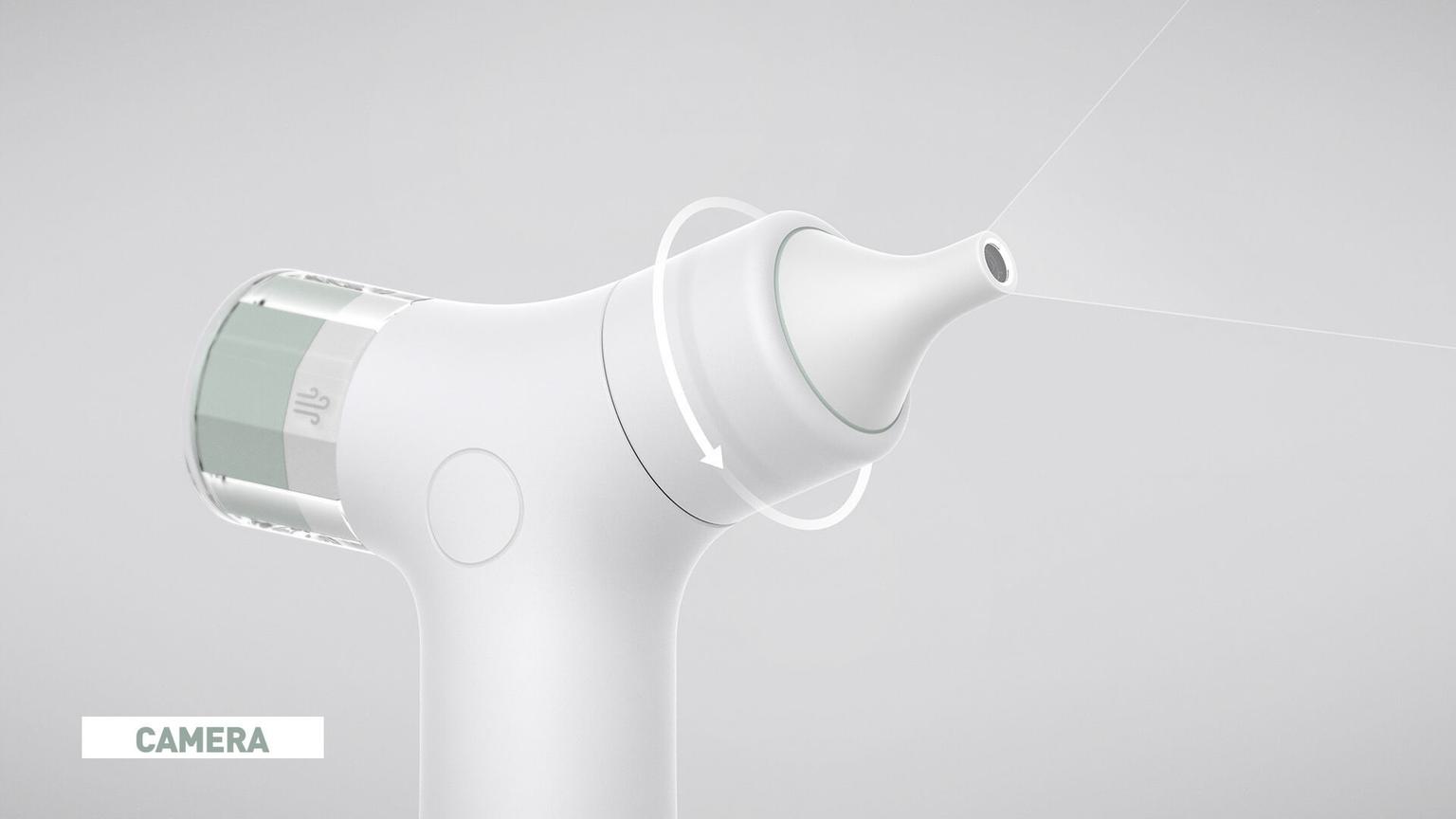
Addressing a wide range of reasons for doctor visits, HomeHealth unifies three different monitoring technologies in one handheld device: a spirometer, a stethoscope, and a camera. People can check their breathing and heart rate and monitor that data over time with AI that alerts both patient and doctor of notable changes and patterns. According to the Mayo Clinic, skin problems are among the top three leading reasons people visit their healthcare providers; HomeHealth’s camera enables users to capture and track skin abnormalities easily. The combination of machine learning and our design’s ability to be integrated with additional equipment and technologies offers lifesaving advantages, for example, syncing the device’s data with a repository of skin cancer imaging for early-onset warnings.
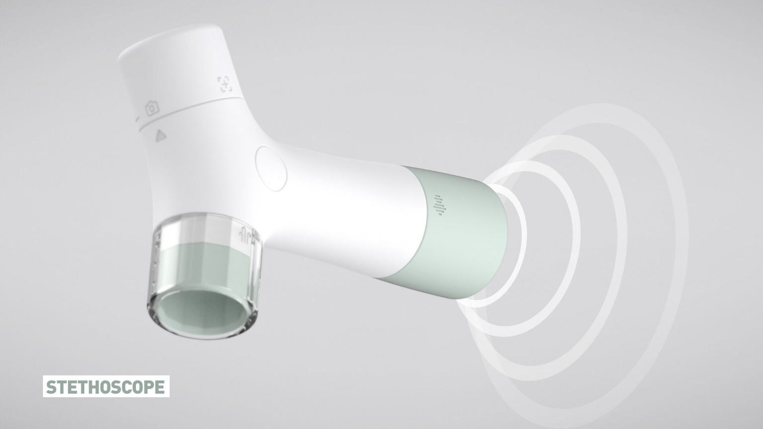
Access to accurate data means better, closer monitoring. Doctors and AI can detect anomalies, red-flag or write off concerns, and quickly determine whether an in-person visit is necessary. The actual intelligence and algorithms pulled from the device’s data can even be more powerful than a five-minute in-person assessment. And with patients proactive at home, it also alleviates the heavy amount of provider time spent on paperwork and redundant protocols. Both user groups can focus on priorities and betterment.
The true innovation of HomeHealth was repackaging readily available technology in one smart design to make it immediately accessible.
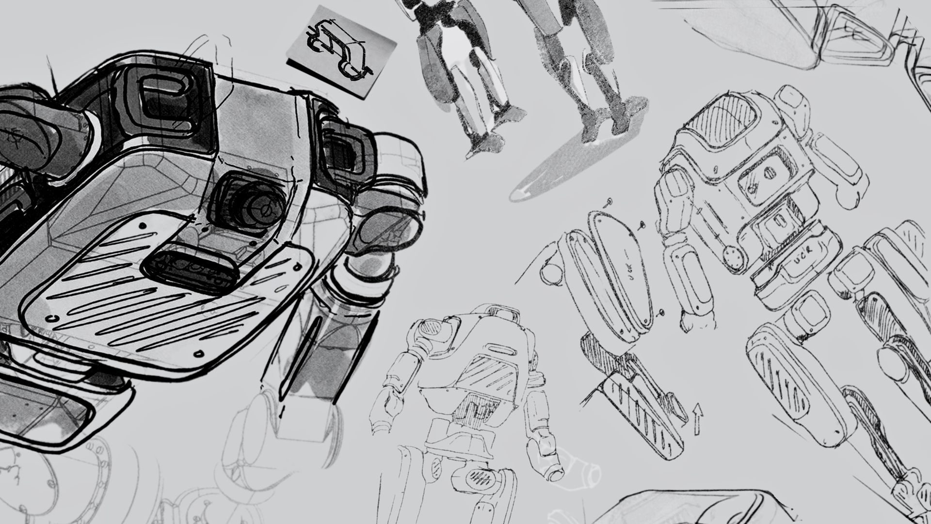
The true innovation of HomeHealth was repackaging readily available technology in one smart design to make it immediately accessible. After optimizing the configuration of hardware and technologies, we validated form and function in a 3D-printed prototype that we used as a tangible centerpiece in conversations with Seattle and Bay Area healthcare professionals.
Our concept wasn’t intended to be a silver bullet for the medical industry; rather, a vessel to inspire a fresh perspective and showcase the way we, as designers, go about problem-solving and innovation in product design. Although terms like “human-centered” and “a 360 approach” are overused in design, their meaning is authentic here. HomeHealth’s functionality is all about data quantification, but its roots are grounded in putting people first—patients and professionals—to address a real-world problem through meaningful design. If you’ve got some insights to add, we’re all ears. Reach out to our team at hello@teague.com.
