Mobility

Warren Schramm | Technical Director

Warren Schramm
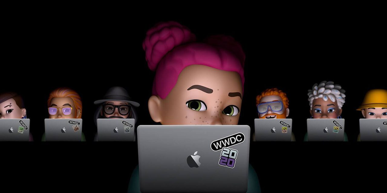
With more than two decades of information technology experience, ranging from product development to enterprise architecture, Warren provides a 360 degree perspective of technology.As the WWDC keynote started this morning, the live stream showed thousands of points of light scattered across the globe, each point a Memoji representing a developer signing in to the live stream. The dopamine hit from seeing all the other AppleFans reminded me to stay objective and avoid the hype. Looking just below the Apple Halo effect, this year's show points to some powerful design trends. Innovators, take note.
Design Trend 01
Better support for voice messages and dictation (without the cloud) was announced. In the land of Covid our virtual interactions have made our technology a critical part of how we interact with others. Regardless of what the Gen-Z kids say, when two humans are in the same space the default method of communication is to talk to one another. For our tech to get to the next level of importance in our lives, for it to really assist us in our day-to-day tasks, it needs to be as responsive to voice as another human would be. That level of interaction will be critical for the success of MR/XR applications for something like Apple Glass. Not just what a user says, but the context of all the conversations going on around you.
DESIGN TREND 02
There are still many people who find joy in handwritten notes, but for those notes to be leveraged in the digital world your tech needs to be able to read your handwriting. Handwriting is being elevated to a first-class input method with support for search and, more importantly, copy and paste. Drawing an octagon, and holding the pen for a moment at the end, lets the machine clean up the drawing to make it crisp lines, as the person intended. Making the inference of the user's intent is huge and this feels like just the beginning. The more examples of written human to human communication they experience, the better the device will be at communicating with us. Remember when Clippy said, “It looks like you’re starting to write a letter”? Imagine if your tablet could remind you of a note you made two years ago about a similar topic.
DESIGN TREND 03
These microservices turn our interaction model upside down. Instead of figuring out what app could help you do something, you tap the phone (or scan a QR code) and the phone helps you. We talk about “deep-links” all the time, this is a physical example of that. Doing it now with NFC or glyphs easily transfers to a MR/XR solution using Apple Glass. This pattern is already in wide use throughout Asia with micro apps in WeChat. The perceived user experience is important, it appears their phone helped them achieve something. They didn’t have to learn a new app, their device helped them. This further pushes the expectation that our technology is a partner helping people achieve their goals, versus a tool that a person masters.
The keynote had other wonderful things for the AppleFan in me. The user experience between mobile and desktop operating systems are converging. Sensors in AirPods are being exploited to simulate 3D sound that is aware of the orientation of the listeners head, and the device they are listening to. Apple Watch has a new method of quieting your digital life to get your body ready to sleep. What really stood out was the focus on natural interactions. It feels like Apple is inviting designers to create apps that interact more like an expert and less like a precision instrument.